Website Redesign
Daniel Alexander — The Valthakan Times
Content Creator & Digital Media
Mission & Core Values
To design a platform that balances storytelling and usability, making content both engaging and easy to navigate.
The experience aims to increase subscription conversion, strengthen brand credibility, and support long-term audience growth.
At the same time, it positions Daniel as a trustworthy creator, enabling clearer pathways for business partnerships.
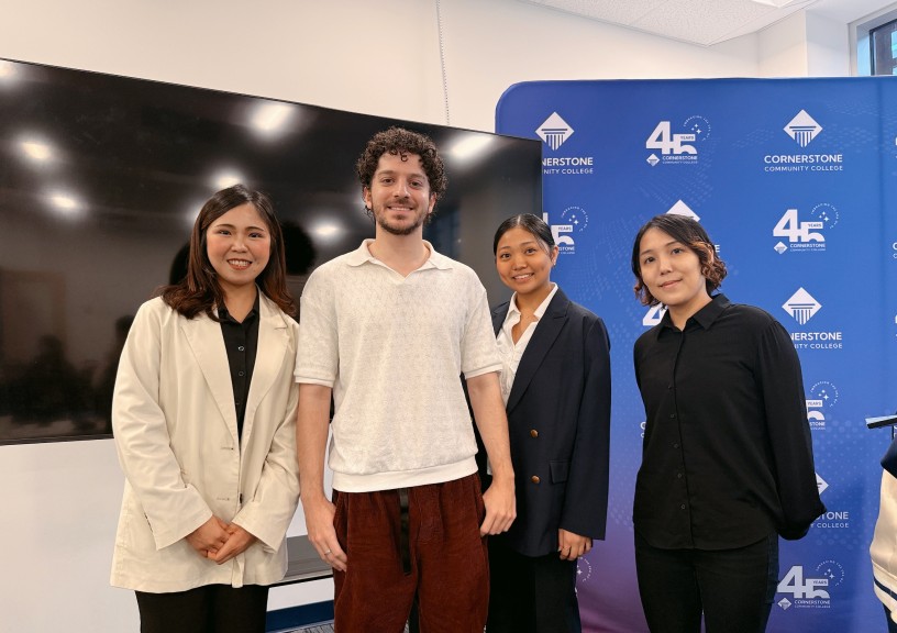
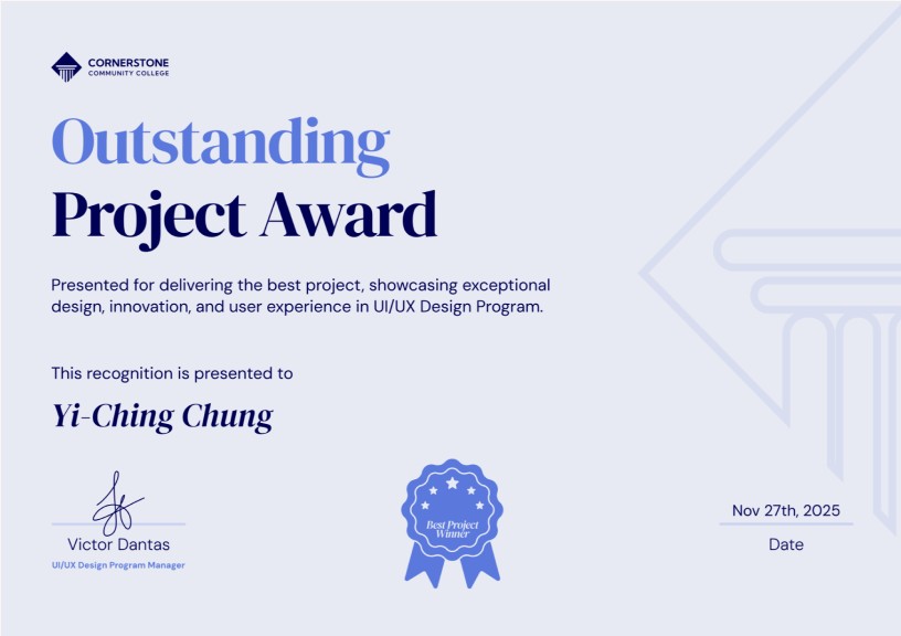
🏆 Project Achievement: 1st Place Winner
This project was part of a final course competition with direct client collaboration and live presentations. Our team won the Best Project Award, and several of our proposed solutions were later adopted by the client.
Project Overview
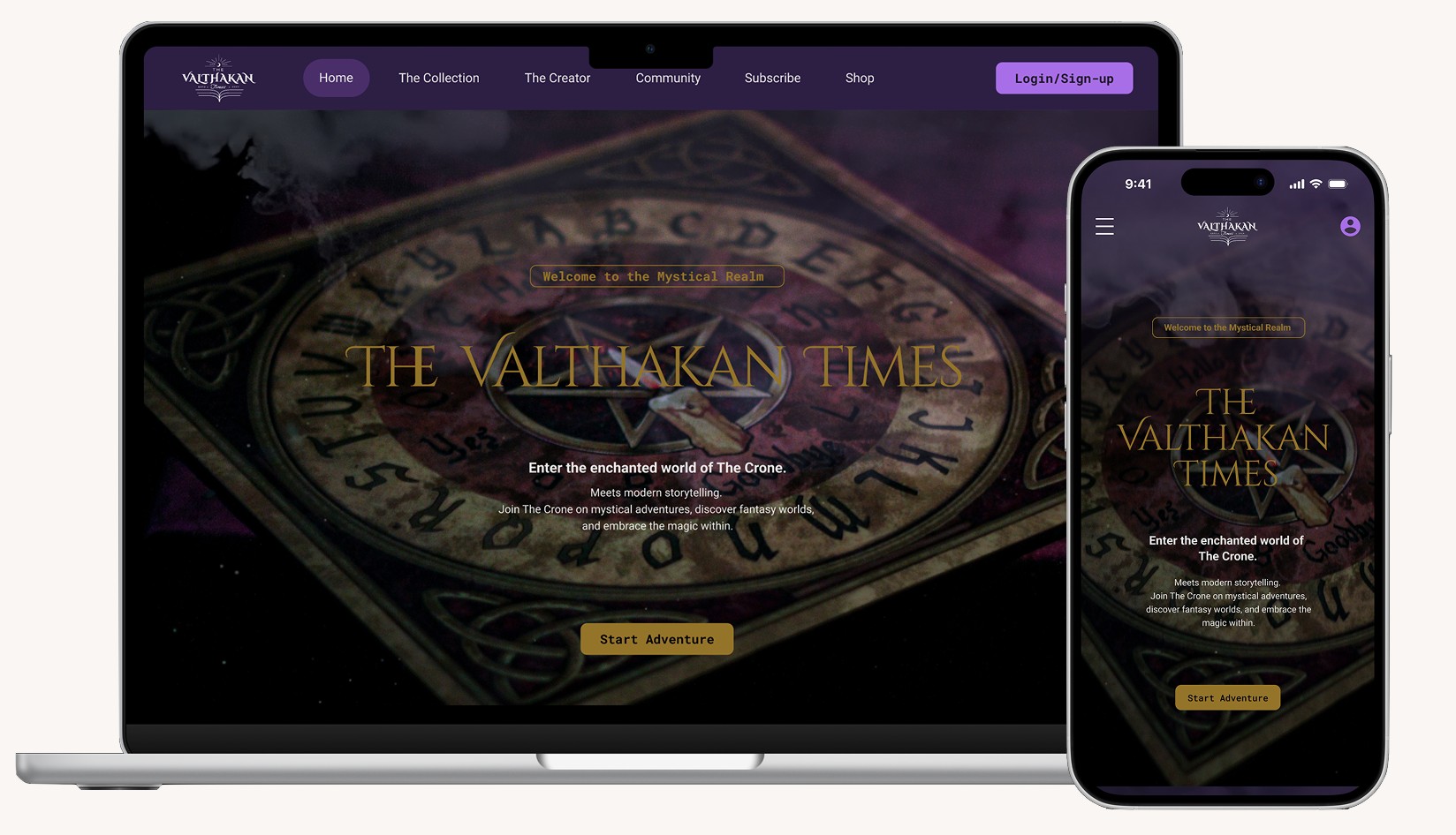
This project was a collaboration with content creator Daniel Alexander, redesigning his website to solve real user experience and business challenges.
The goal was to improve navigation, clarify the subscription model to increase conversion, and strengthen brand identity to build trust and support future partnerships.
As team leader, I directed five designers across UX and UI execution — from research through final handoff.
Client & Industry
Daniel Alexander (Canada)
—
Content Creator / Writing / Digital Media
My Role
Team Leader &
UI/UX Designer
Type
Website Redesign
Platform
Responsive Web
Team & Timeline
5 Designers
(including 2 remote members)
—
4 weeks (Oct 27 – Nov 21, 2025)
The Challenge
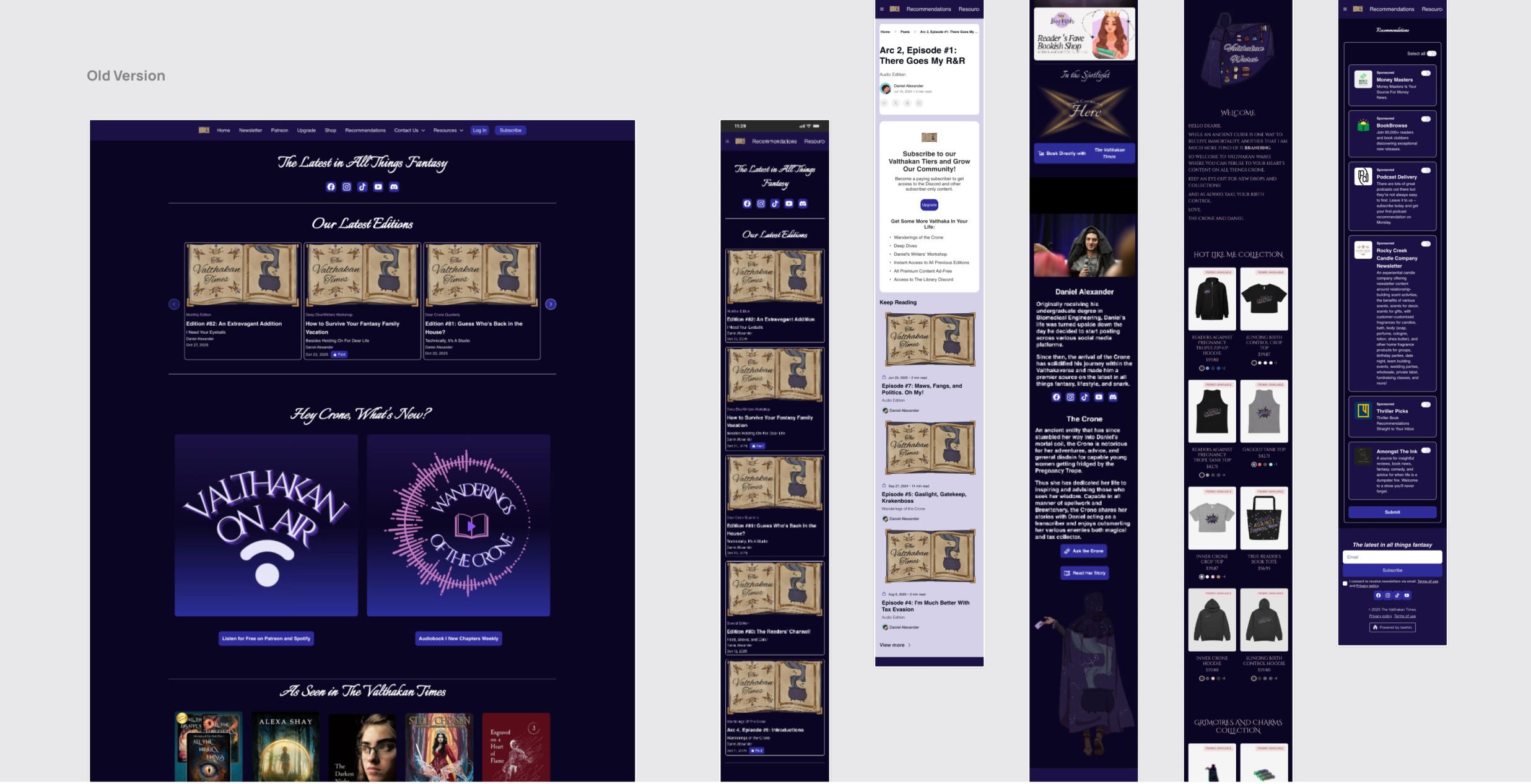
1. Unclear NavigationUsers struggled to explore content due to a confusing and unstructured layout.
2. Subscription Confusion (42.9%)42.9% of users struggled to distinguish between free and paid content.
3. Blocked Business OpportunitiesInconsistent branding and presentation limited credibility and partnership potential.
The Solution
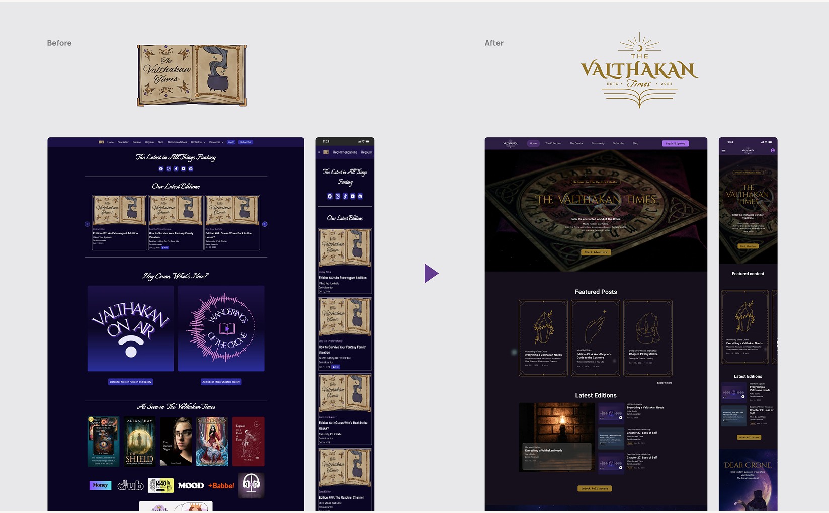
1. Navigation & Subscription Clarity FixRedesigned the information architecture to include a "Sticky CTA" and a clear subscription menu, reducing friction in the user journey.
2. Brand Value ReinforcementWe refined the visual identity and storytelling approach to build a more premium, trustworthy brand feel.
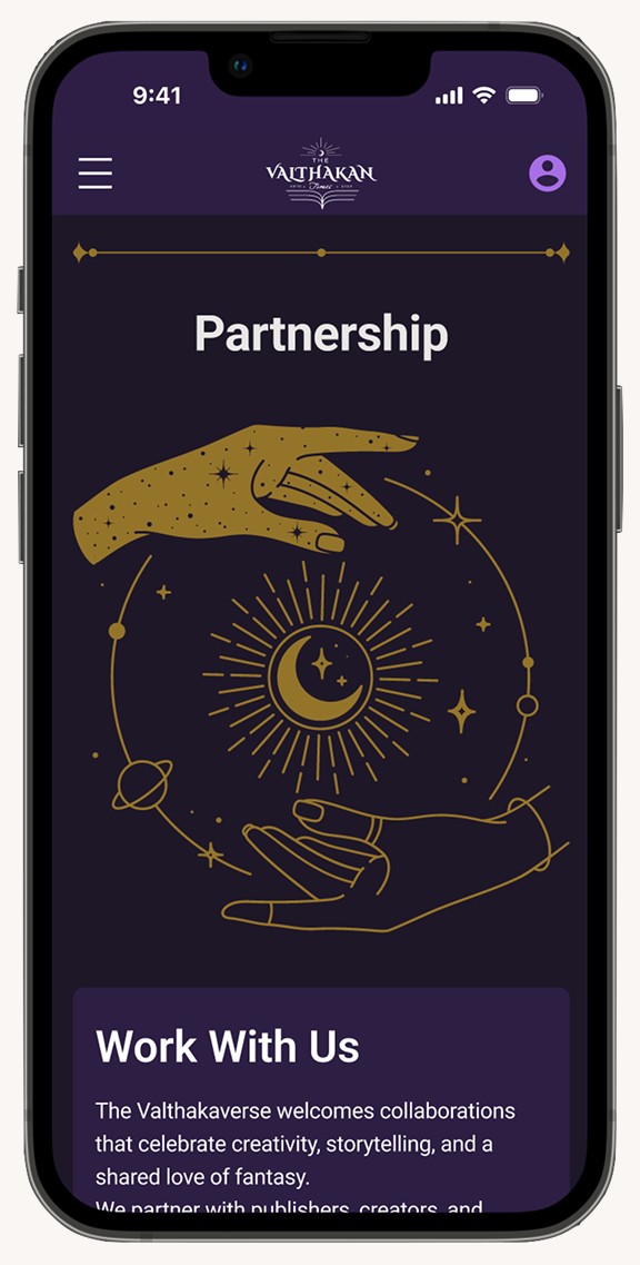
3. B2B OptimizationCreated a dedicated Media Kit and partnership flow, allowing collaborators to vet Daniel's value in under 30 seconds.
HMW Statement
“ How might we design a clear and engaging experience that guides users from discovery to subscription while building trust and supporting business growth? ”
Our Approach
STEP 1. Empathize
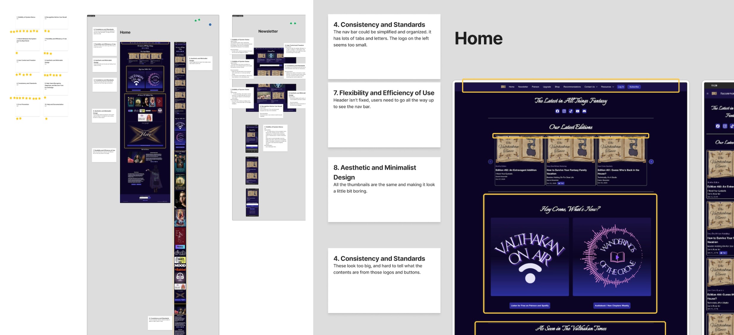
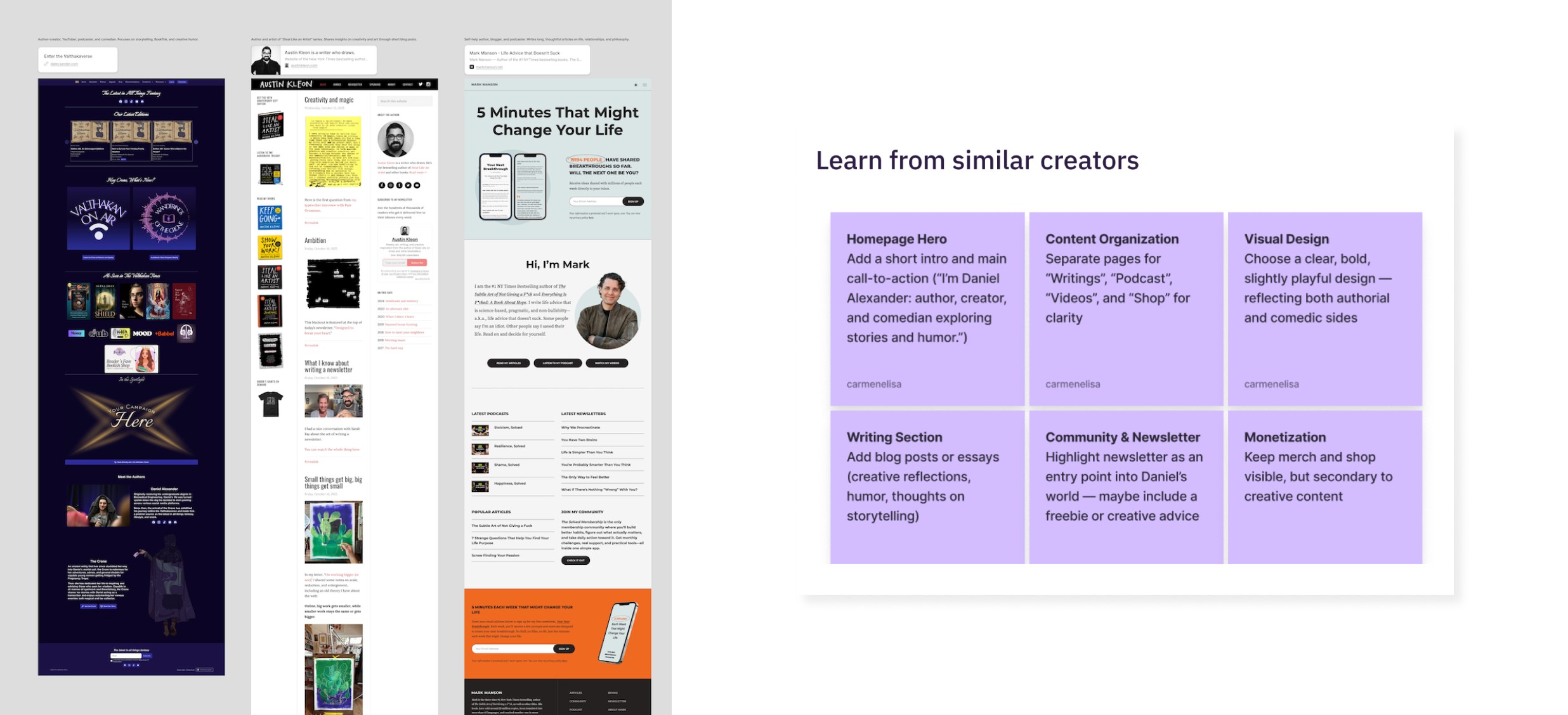
We conducted Heuristic Evaluations and Competitor Analysis to identify friction points in the existing platform and benchmark industry standards for elite content creators.
STEP 2. Define
By synthesizing research into User Personas and a CSD Matrix, we defined the core problem: a lack of visual hierarchy and professional trust that hindered subscription growth.
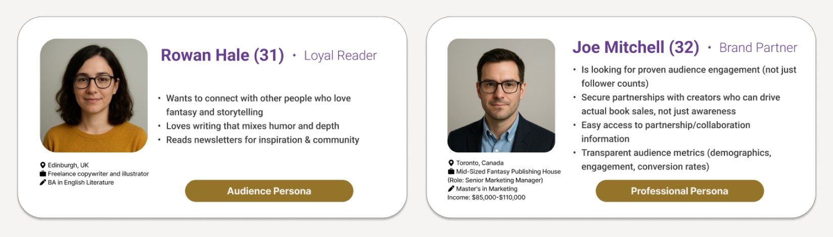
User Personas
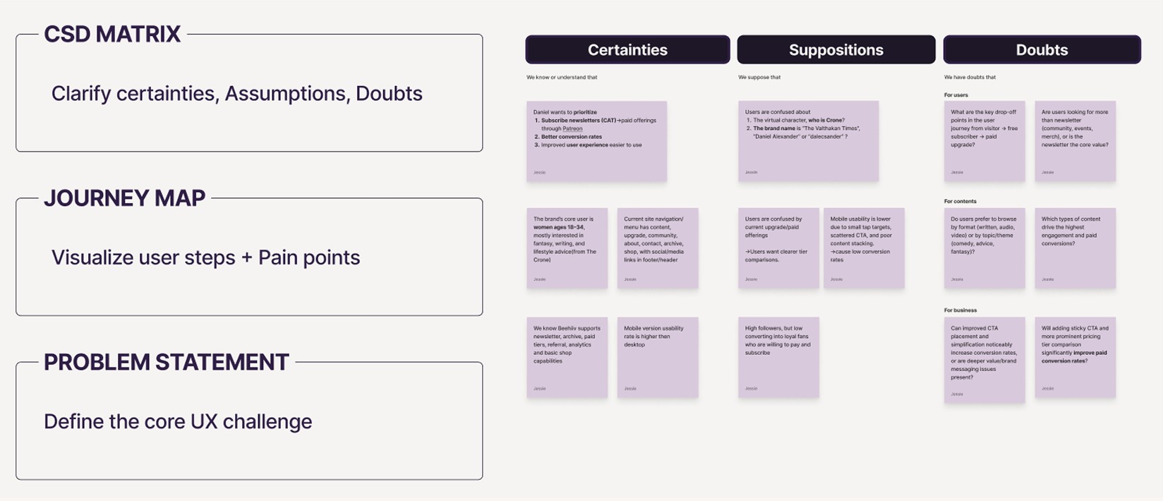
CSD Matrix
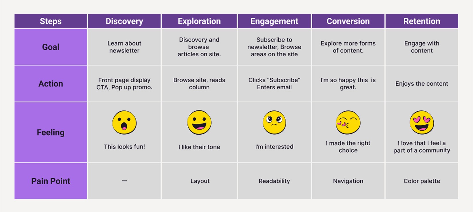
Journey Map
STEP 3. Ideate
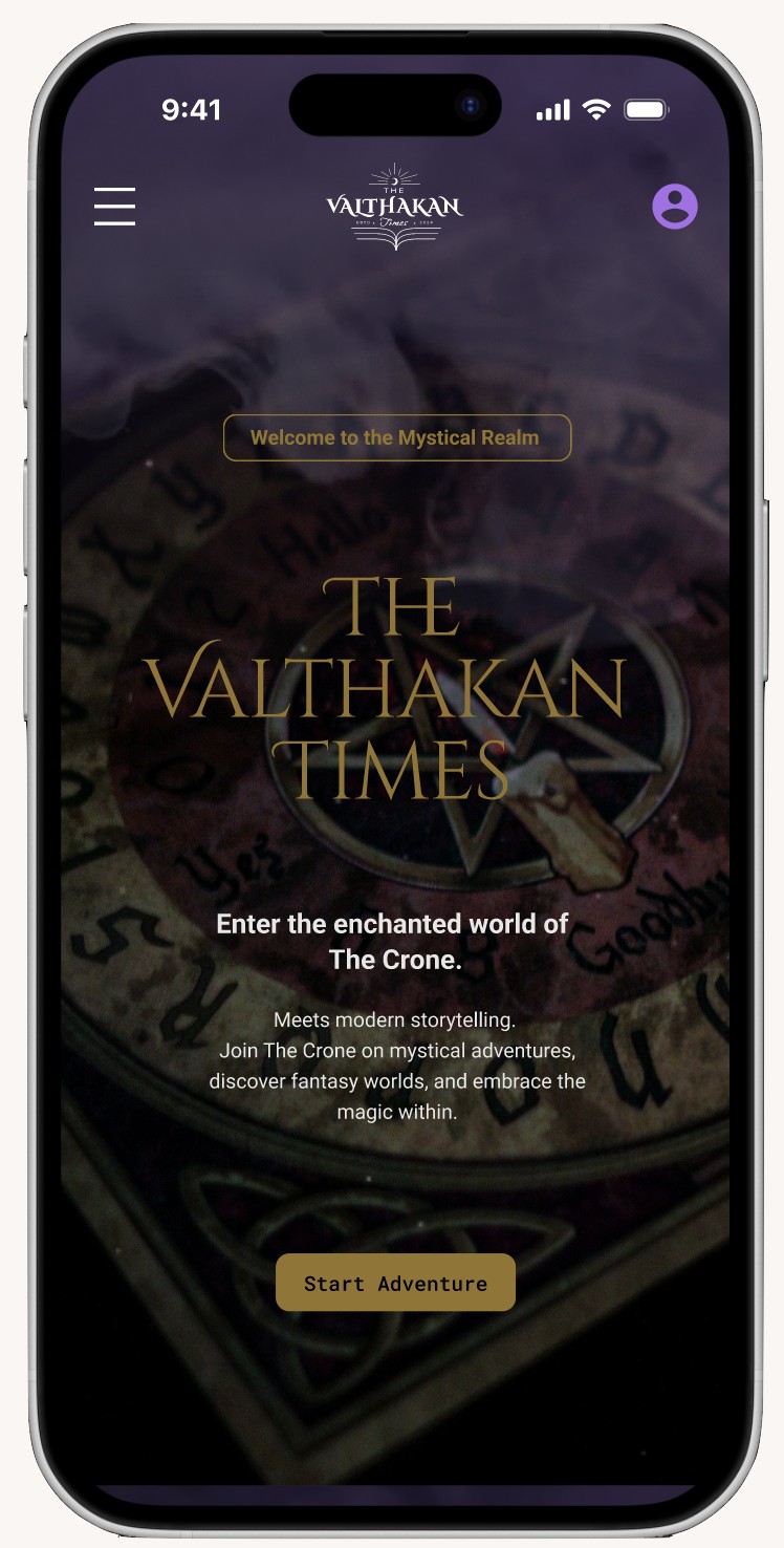
We modernized the brand identity with a refined color palette and typography, ensuring the "Valthakan" mystical aesthetic was balanced with high-conversion UI principles.
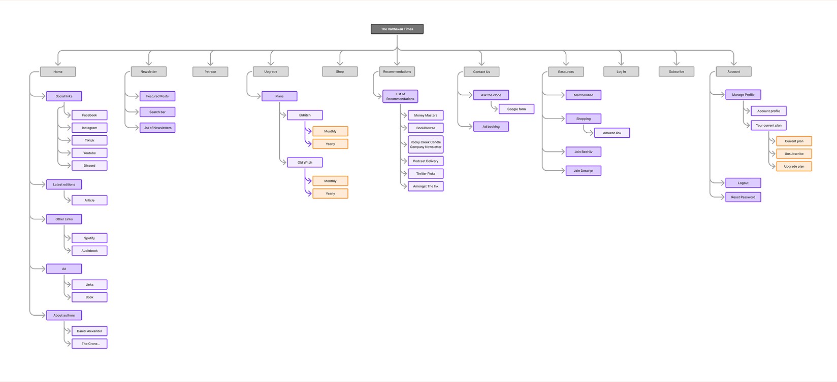
Old Sitemap – Issues
Unstructured navigation led to 42.9% user confusion and 0% conversion clarity, increasing friction and drop-off.
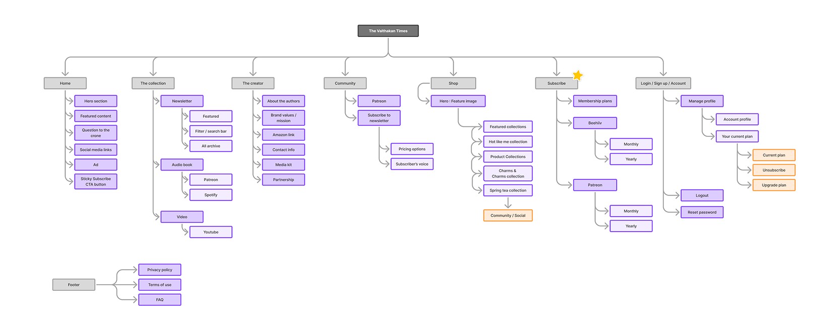
New Sitemap – Solution
Improved structure achieved 100% task success rate and reduced confusion from 42.9%, enhancing navigation and conversion efficiency.
- Clearer information architecture — reorganized into 7 focused sections instead of a sprawling, uncategorized menu
- Dedicated Subscribe entry point — previously buried under "Upgrade," now a top-level nav item
- Consistent naming and grouping — reduced overlapping links and ambiguous labels across sections
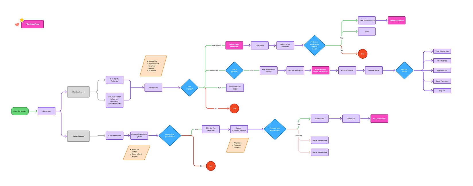
Userflow
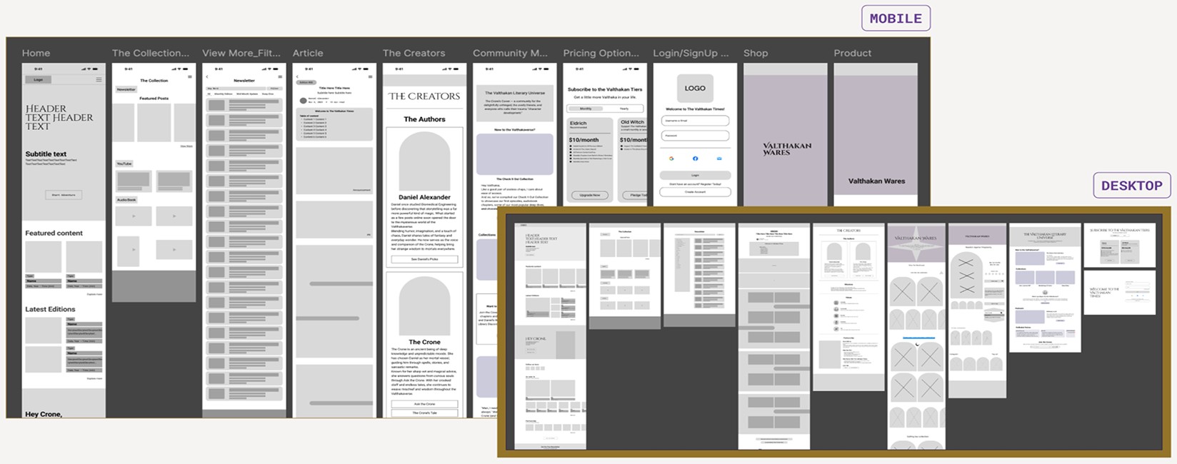
Wireframes – Mobile & Desktop
Design Display
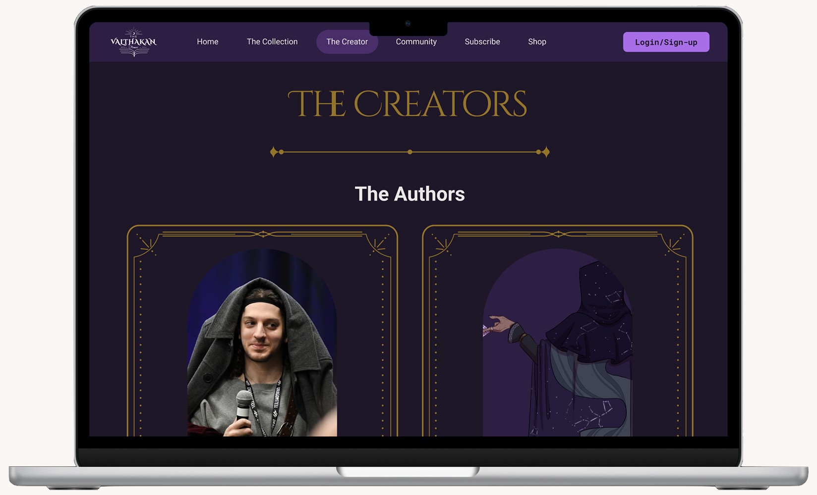
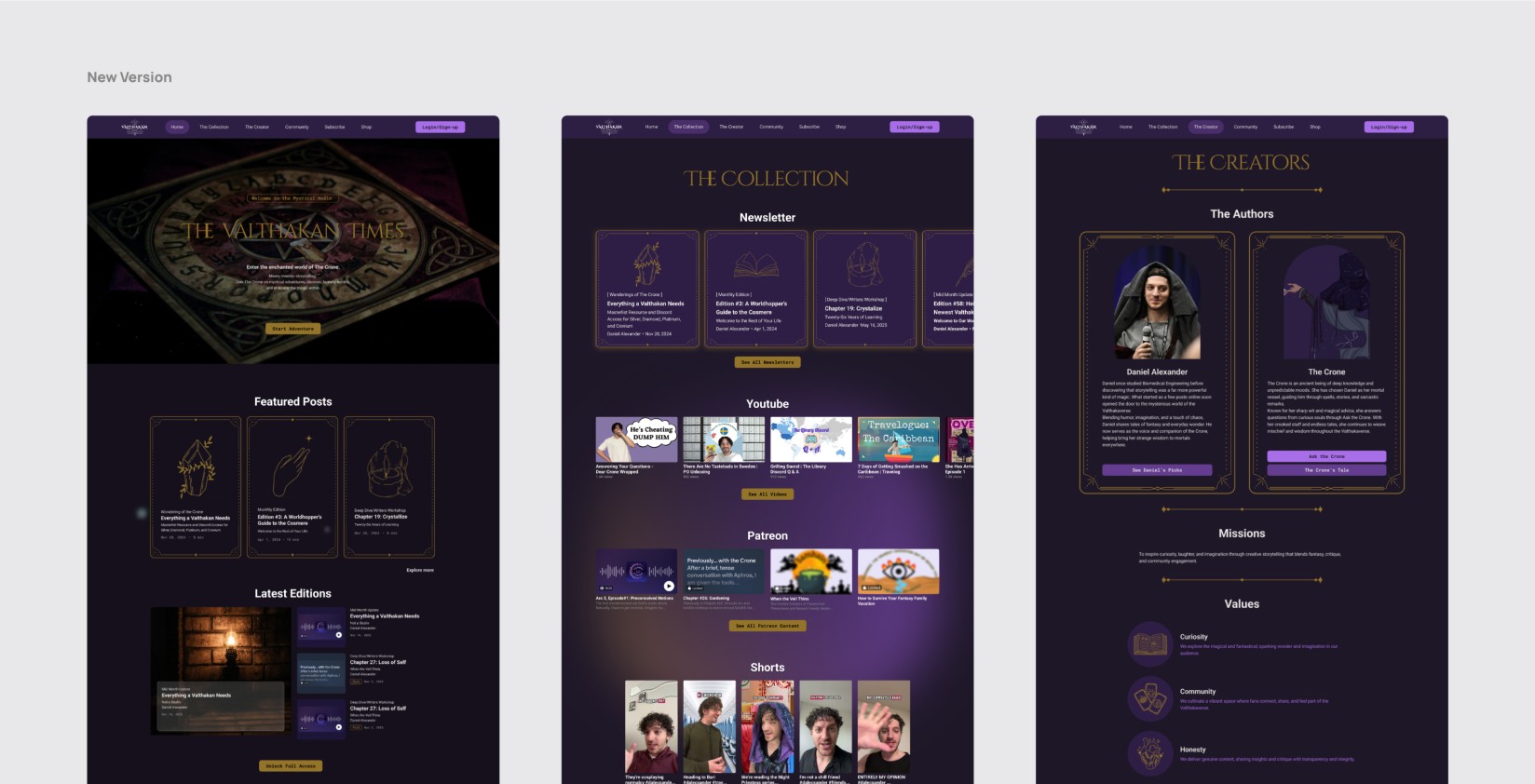
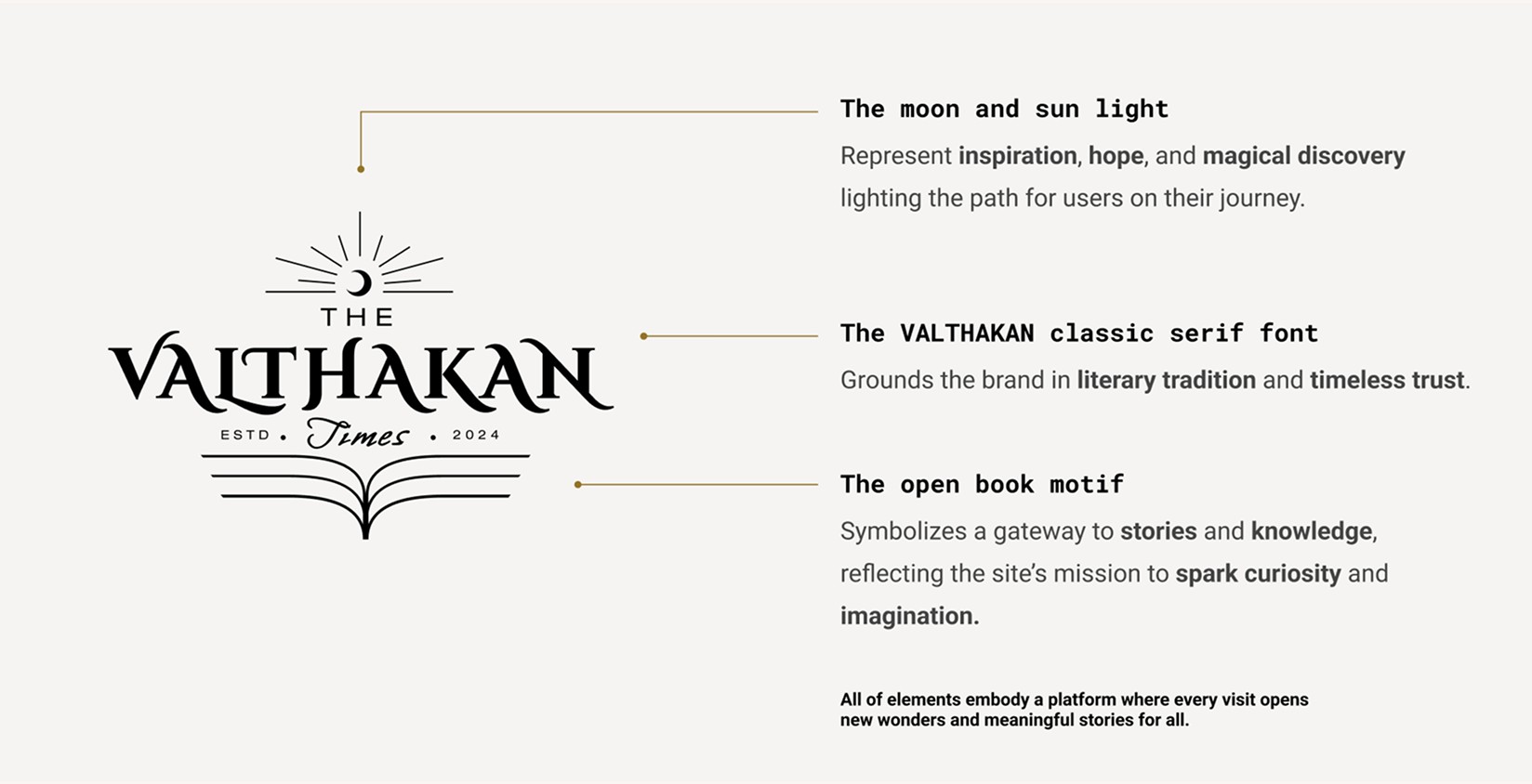
Rebrand identity
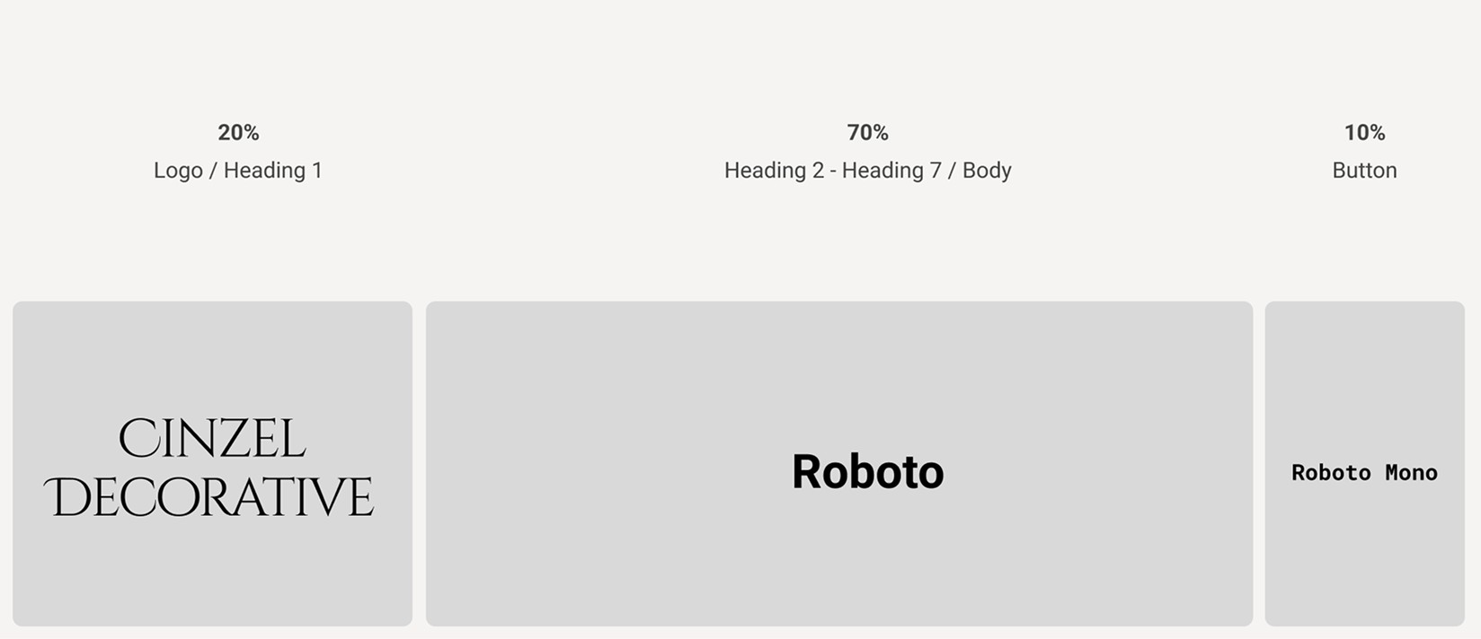
Typography
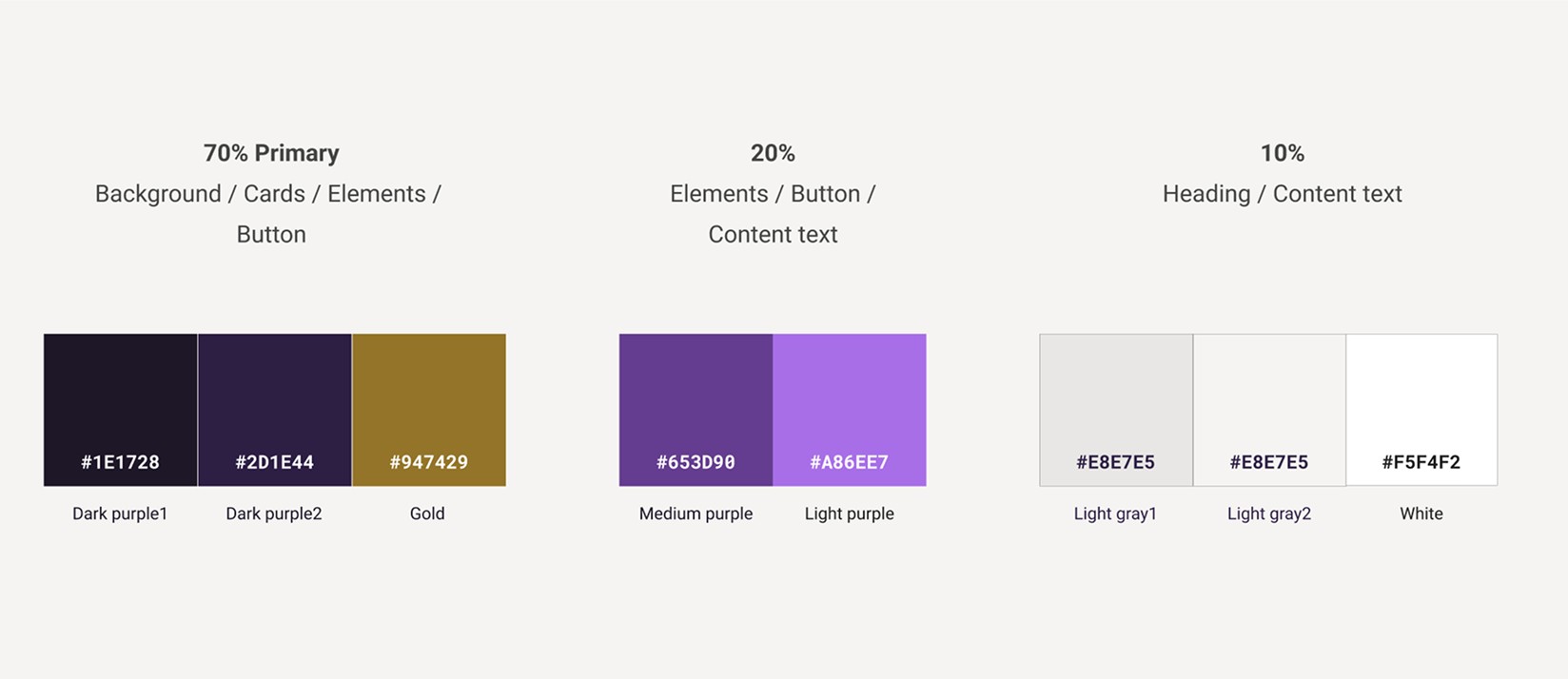
Color Palette
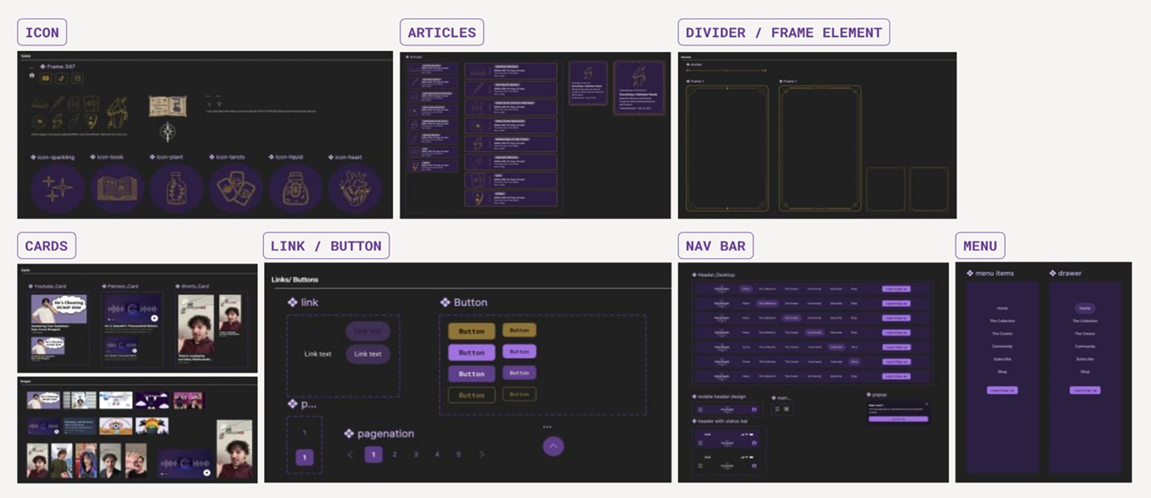
UI Kit
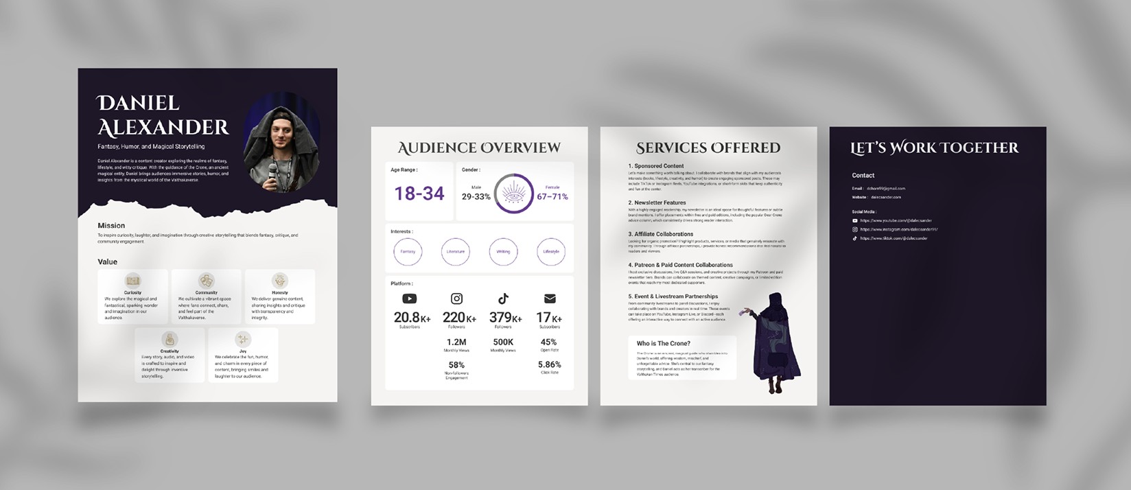
Media Kit
STEP 4. Prototype
I led the creation of low- to high-fidelity prototypes and a scalable UI Kit, enabling seamless collaboration between local and remote team members.
Key Design Improvements
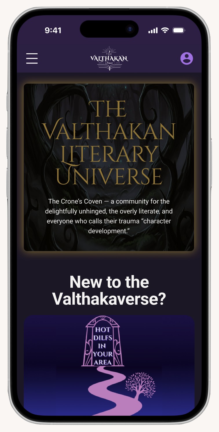
Streamlined Navigation Hierarchy
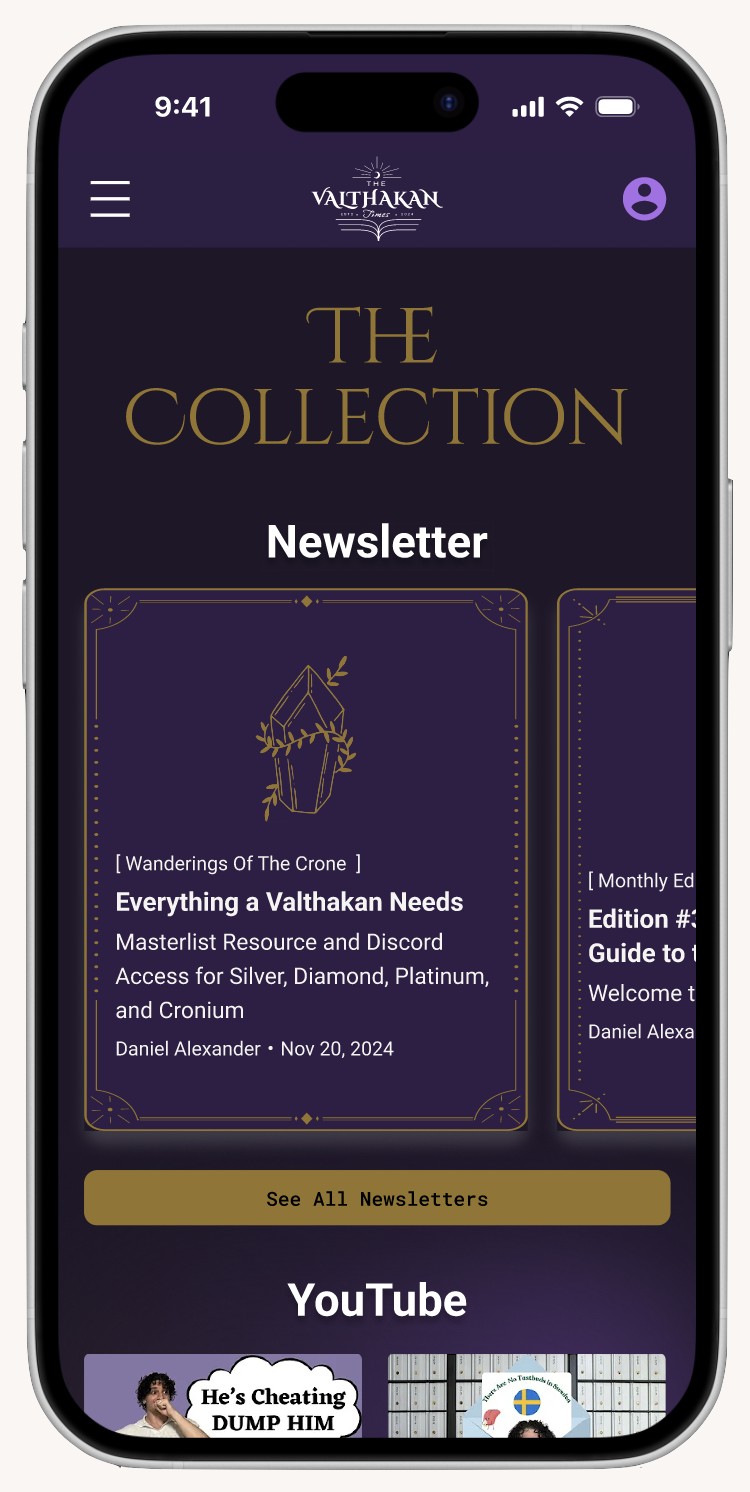
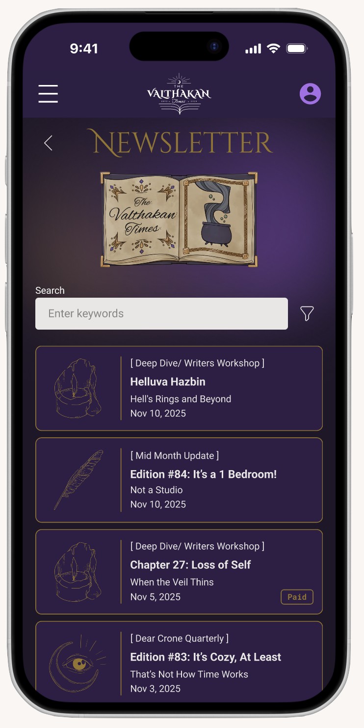
Transformed the cluttered link-hub into an intuitive sitemap, allowing users and business partners to find key information in seconds.
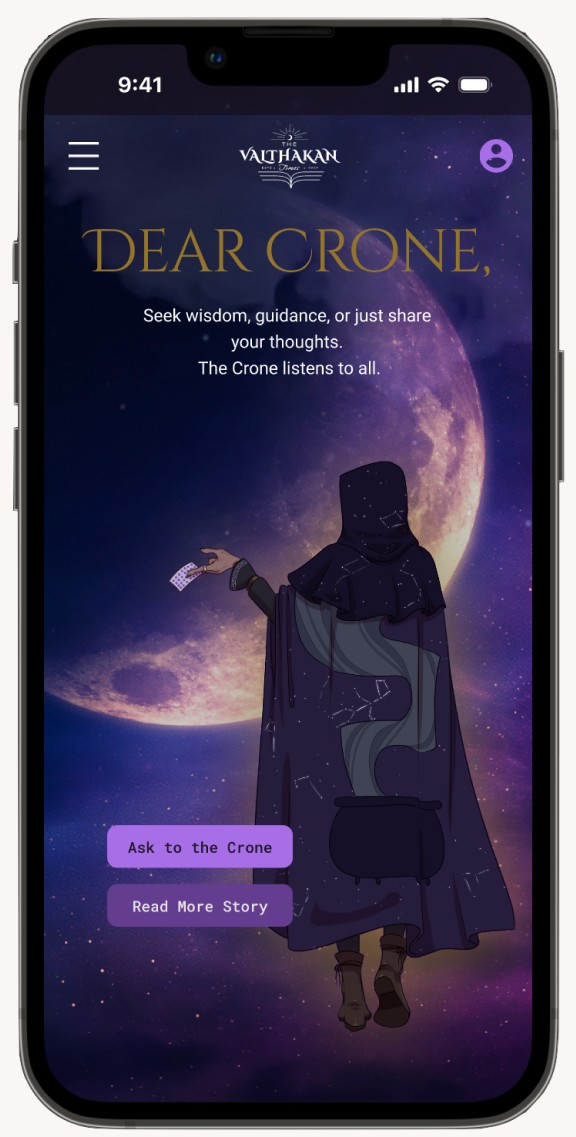
Immersive Brand Storytelling
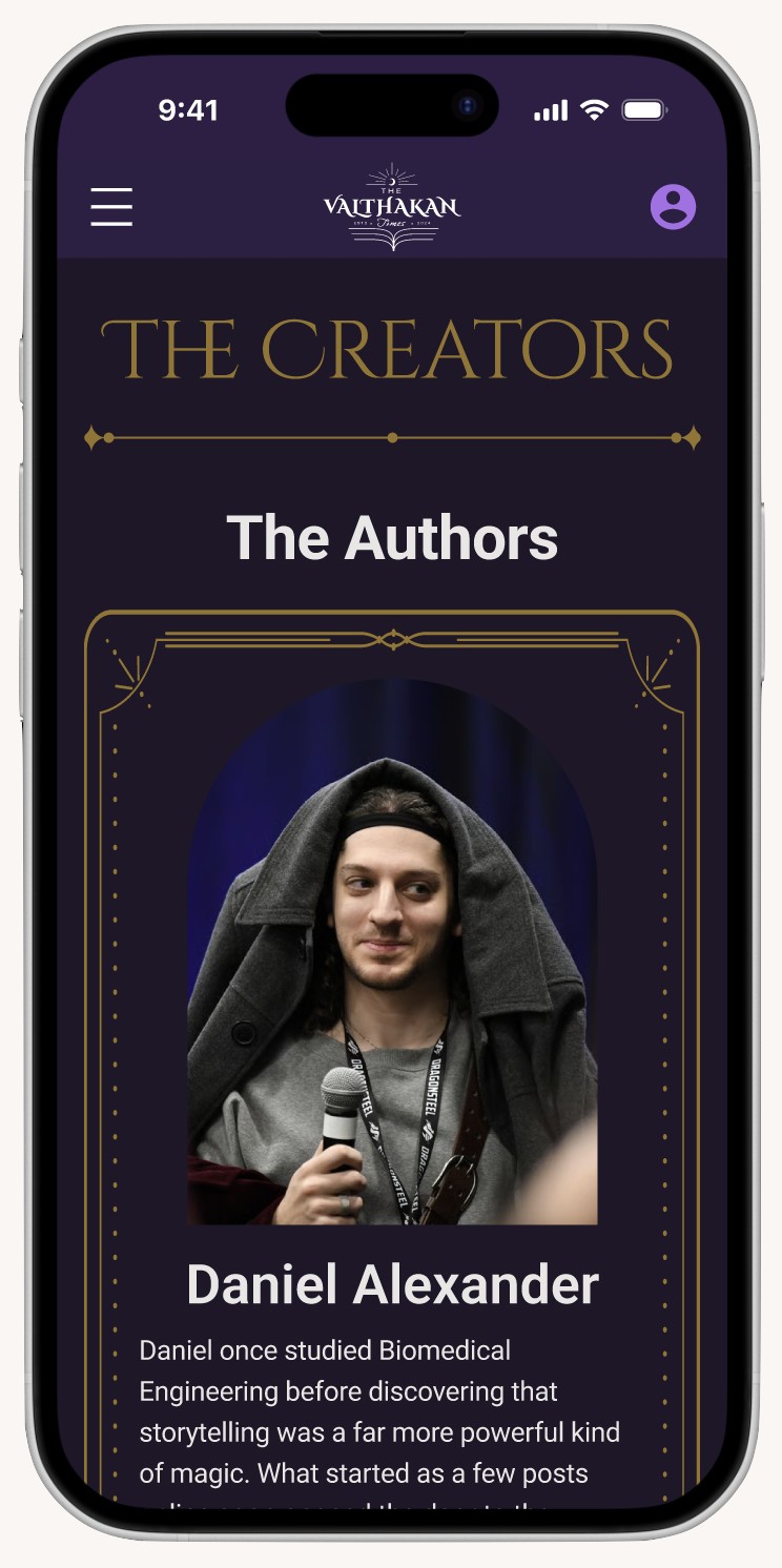
Elevated the visual identity with refined typography and a "Valthakan" aesthetic that builds professional trust while maintaining Daniel's unique creative voice.
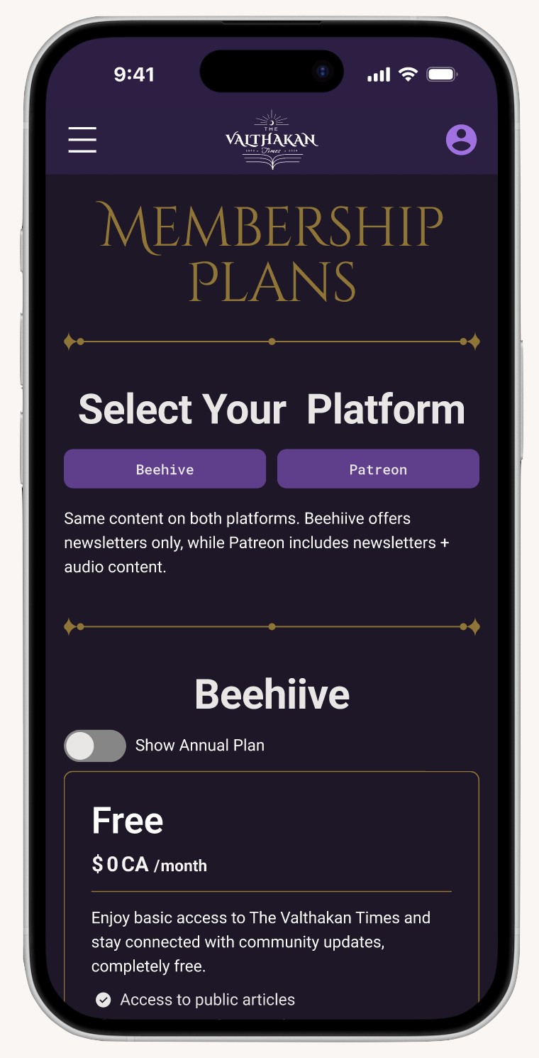
Conversion-Driven Subscription Flow
Introduced high-visibility CTAs and a clear visual distinction between free and premium content to reduce churn and boost Patreon sign-ups.
STEP 5. Test & Analysis
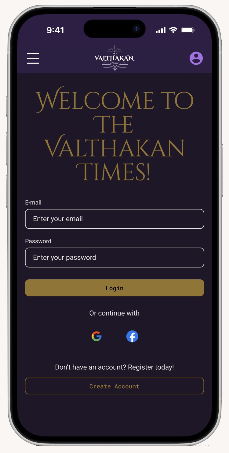
We conducted usability testing and A/B testing with 9 mobile participants — 7 from the target audience and 2 prospective partners — to validate key flows including subscription, content discovery, and partnership access.
Usability Testing Findings
85.7% task completion rate in navigation
85.7% visual design approval
71.4% overall satisfaction
42.9% users confused about subscription clarity
0% found the subscription process convenient
Main Problems
1. Subscription Clarity Gap (42.9%)Users were confused about free vs paid content and pricing differences.
2. Conversion Friction (0% Convenience)No users found the subscription process easy or intuitive to complete.
3. Hidden Upgrade Entry PointsSubscription options were not visible or centralized within the navigation.
Improvement Solutions
1. Dedicated Subscription EntryAdded a clear "Subscribe" menu in navigation to improve visibility and access.
2. Unified Pricing StructureConsolidated all plans into one comparison page to simplify decision-making.
3. Visual Content DifferentiationIntroduced lock icons on paid content to clearly signal access levels.
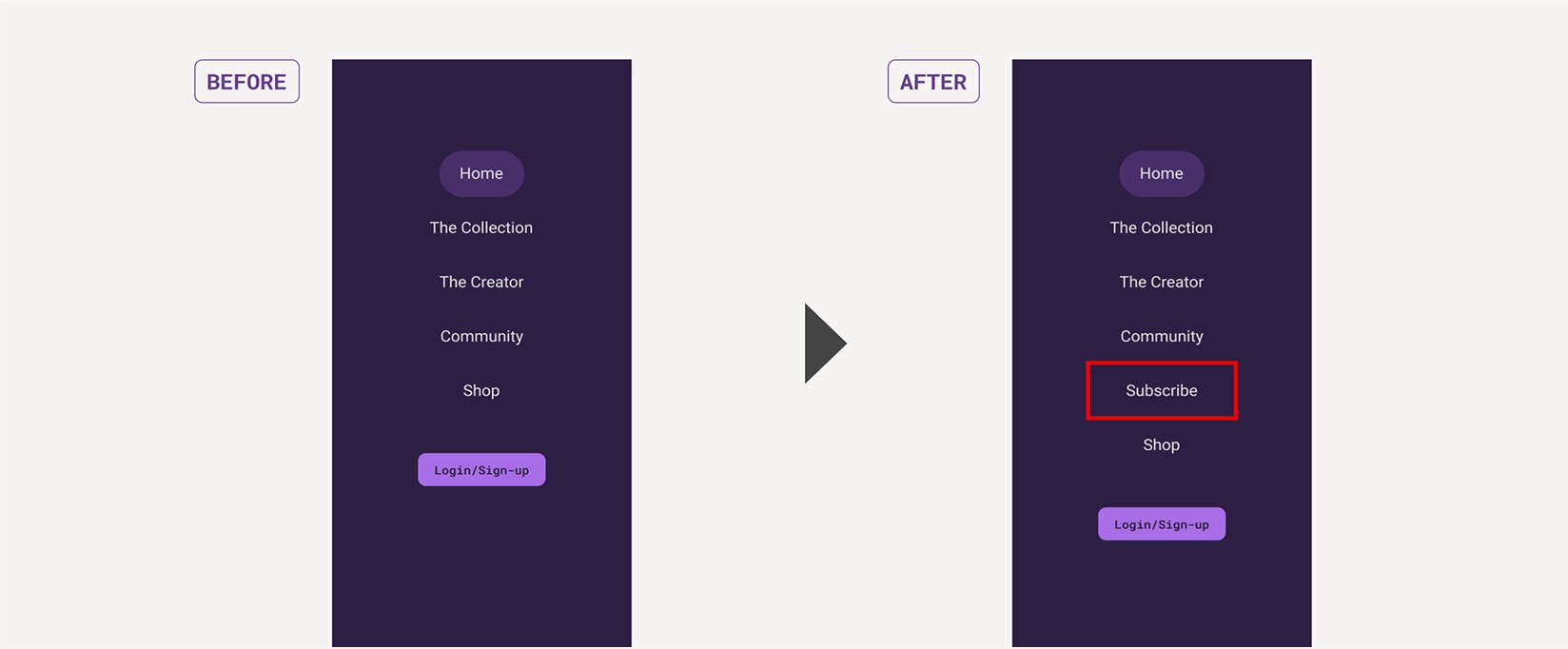
Solution 1. Added a clear "Subscribe" menu in navigation to improve visibility and access.
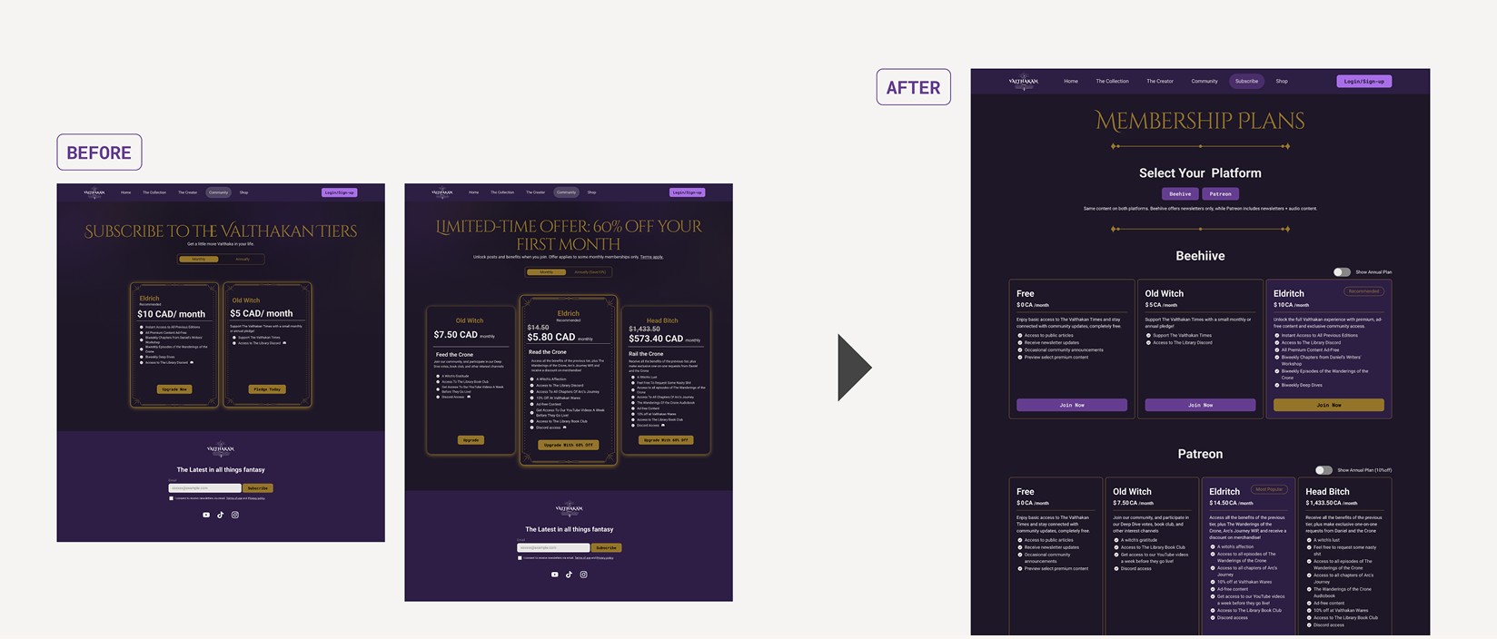
Solution 2. Consolidated all plans into one comparison page to simplify decision-making.
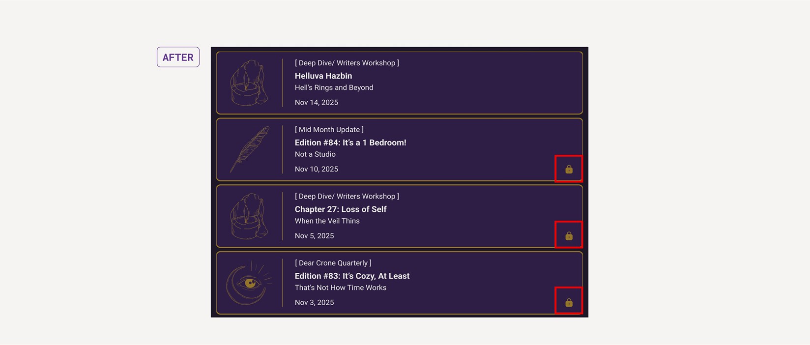
Solution 3. Introduced lock icons on paid content to clearly signal access levels.
Outcome & Impact
The redesign improved navigation clarity and created a more intuitive path from content discovery to subscription. It also strengthened brand credibility and provided a clearer structure to support user engagement and future business partnerships.
Key Results
Reflection
Understanding Real Client Needs
Direct client interviews surfaced gaps in navigation, conversion flow, and brand clarity, helping us align user needs with business goals.
Designing with Purpose
We translated those insights into focused UX solutions — simplifying structure, clarifying the subscription model, and strengthening the overall user journey.
Leadership & Growth
As team leader, I coordinated local and remote collaborators across a tight four-week timeline, learning how to align a team and deliver results that a real client could act on.